

"display: flex;"
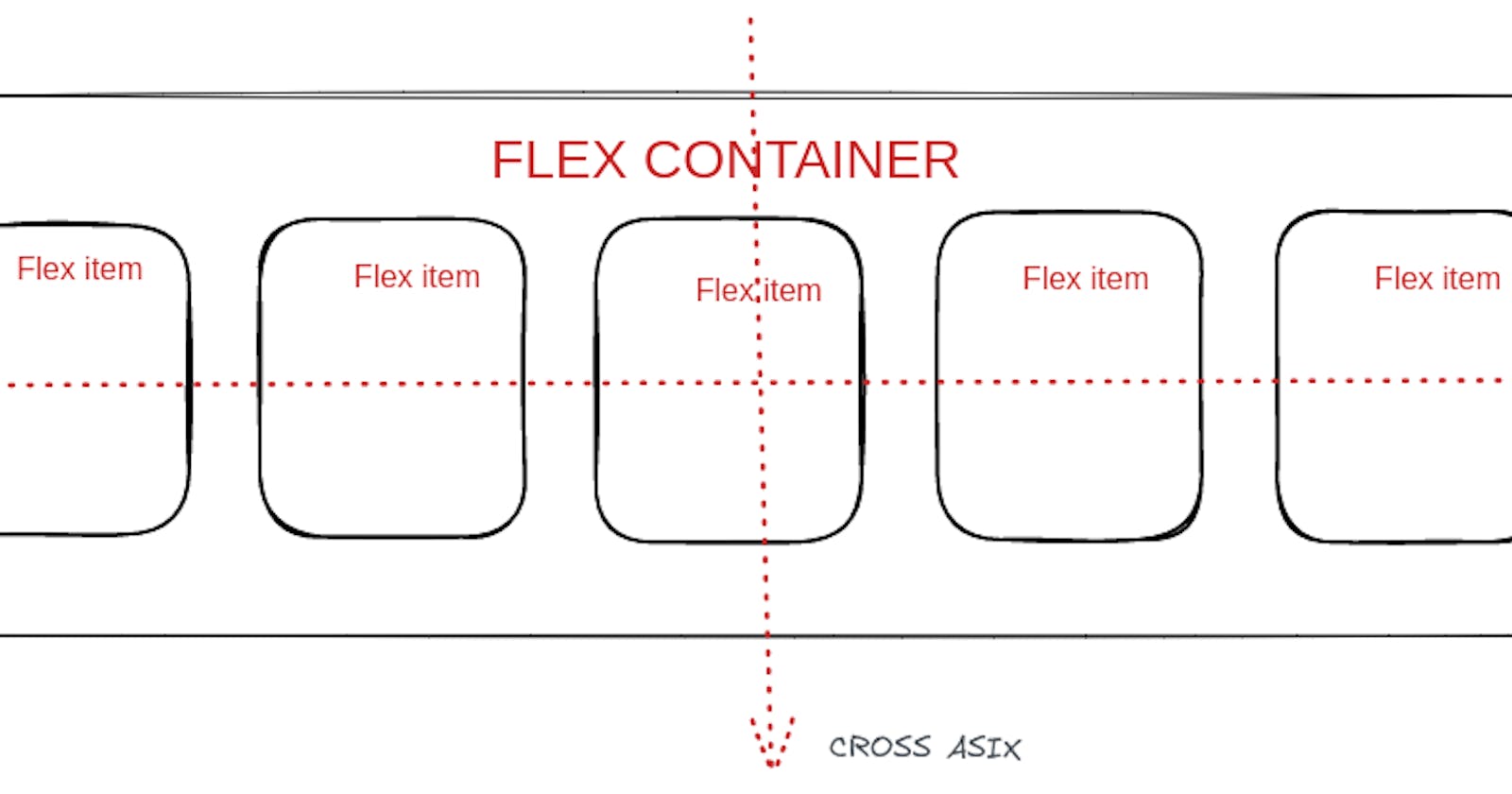
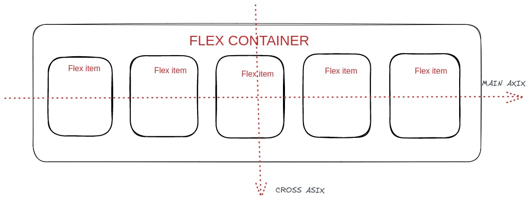
The single magic line above changes the design and layout of the content inside a parent and gives us the power to use flexbox. Flexbox is a set of CSS properties that helps us to build 1-dimensional layouts. The main idea behind flexbox is that space inside a container element can be automatically divided by its child elements. When working with flexbox we need to remember the two axes — *the main axis(*horizontal axis) and the cross axis(vertical axis). Remembering the axes helps us to align items to one another inside a parent container, both horizontally and vertically.
Flexbox solves common problems such as vertical centring and creating equal-height columns. Flexbox is the best alternative to floats, allowing us to write fewer and cleaner codes.
Some of the Flex-properties used with the parent container are:
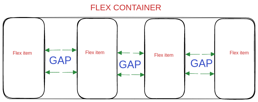
gap:
It's the property in the flexbox that helps us to create our own required space between items without using the margin property of CSS. [ gap: <length\> rem/px ];
justify-content:
This property of flex allows us to align items along the main axis, which by default is horizontal. We can set our items using the following different values - [ justify-content: flex-start; flex-end; center; space-between; space-around; space-evenly; ].
align-items:
This property allows us to align items along the cross axis, which is vertical by default. Some of the different values to be used by the property are - [ align-items: stretch; flex-start; flex-end; center; baseline; ]
flex-direction:
This property defines the main axis, i.e. It specifies the direction of the flexible items. The values used with this property are - [ flex-direction: row; row-reverse; column; column-reverse; ]
flex-wrap:
This property allows items to wrap into a new line if they are too large to fit in the container. The main values used with this property are - [ flex-wrap: nowrap; wrap; wrap-reverse; ]
align-content:
This property specifies how flex lines are distributed along the cross axis in a flexbox container. It only works when there are multiple lines, i.e. when we use flex-wrap: wrap. The values used with the property are - [ align-content: stretch; flex-start; flex-end; center; space-between; space-around ]
Some of the Flex-properties used with the Flex Items are:
align-self:
This property specifies the alignment in the block direction for the selected item inside a flexbox. This property of flex is used to overwrite align items for individual flex items. The values used with it are - [ align-self: auto; stretch; flex-start; flex-end; center; baseling]
flex-grow:
This property specifies how much the item will grow relative to the rest of the flexible items inside the same container. We used this property to allow an element to grow, where zero means no and a positive integer like 1+ means yes. The syntax for it is - [ flex-grow: 0; <integer>;]
flex-shrink:
This property allows an element to shrink where zero means no and a positive integer like 1+ means yes, similar to that we used in flex-grow. If the size of all flex items is larger than the flex container, items shrink to fit according to flex-shrink. The syntax for it is [ flex-shrink:1; <integer> ]
flex-basis:
This property specifies the initial length of a flexible item. i.e To define an item's width, instead of the width property. The syntax of this property is [ flex-basis: auto; <length>; ]
flex:
This property sets how a flex item will grow or shrink to fit the space available in its flex container. It's a recommended shorthand for flex-grow, flex-shrink and flex-basis. The syntax of this property is [ flex: 0 1 auto; <int> <int> <len>]
order:
The order property specifies the order of a flexible item relative to the rest of the flexible items inside the same container. It controls the order of items, where -1 makes the item first and 1 makes it last. The syntax for it is [ order: 0; <integer>; ]